
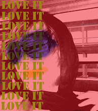
Andrew Bieganski another student in Graphic Design class had an excellent design for the art department. Other students took on the role of working on a creative team to develop the new art/design department designs. It was a blessing working on Andrew's team. His design carried out very well thoughout the whole campaign. The design was very urban yet still kept a Saint Xavier University feel to it. Reds, blacks and gold were very prominant throughout the different design concepts. The design translated well through each piece that was designed. My role was to design the new website for the Art and Design Department. This design was true to Andrew's original design. I kept the same font and brush strokes on the website. I feel that overall the team worked well to complete a great campaign. Each piece is designed in mind with what our school colors are as well as being considered an urban Catholic school.
Overall feel that this last project I had worked on pushed my talent. Since my Senior Project was an advertising plan, which consisted of learning how to market and brand, I felt that the campaign that I worked on in class and my senior project really helped me for the better.

CRAFT
Photoshop
CONCEPT/COMPOSITION
Using the program Photoshop to create this piece was a challenge for me. It was really hard working with each individual layer. Another thing that was a challenge that I had to overcome was working with the special brushes and strokes that Andrew had in his original design. Based off of the original concept, I wanted to stay true to his design which is an urban grunge look to the overall piece. By creating that, I tried to incorporate different brushes and layering them over one another. I also wanted to make the web page interactive which will make students want to scroll through it. As you can see, on the student work link, you cn scroll through different pieces of art work that the students make. Though the overall format of the web page is not standard, it brings a new feel to it which refects the boundaries that artists break with their art. Overall I feel that this is true to the original piece that Andrew created.
No comments:
Post a Comment