
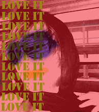
I really wanted the feel of something very bright and colorful since most are has color.


CRAFT
Illustrator
COMPOSITION/CONCEPT
I wanted to create something that has less of a feel of a handout and something a little bit useful. So in this design, I wanted to create a couple of neat features like an easy to read layout of the class schedule, pictures that will grab the viewers eye, a strong consistent design that plays throughout the booklet and a sketch page that will let the potential incoming art students draw and sketch. I played alot with color and text. The text I used was called a college typewriter font and the colors I used were very bright and youthful. I tried to make the inofrmation brochure less formal and tried to make it youthful looking. Though the overall look of it in the end was too youthful. This concept did not make the final cut. But regardless I had a lot of fun designing the brochure. I took a lot of though in it when it came down to the whole look of the piece.
No comments:
Post a Comment