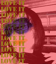
Self Portrait

Self Portrait

Saturday, February 21, 2009

Week 6

This next project that I am working on is one that I am particularly fond of. My challenge is that I have to redesign a label for a product of my choice. This product can be of anything that I want. I feel that this should be my calling to design for a product that will enhance the presentation of the product to a "new" market.

I have always been fond of looking at commercials and print ads for clothing, accessories, and especially food. My favorite product design is Campbell's Soup. I don't know why I have always been fond of the design. The bright red and white label, the typography, and the feel of the can in my hand always just seemed right. The whole aesthetic of the product was perfect.


Now it is up to me to push myself a design a label for a product that I always drink on a daily basis which is Lipton Pure Leaf iced tea. The label of this product recently changed in the past year. The label used to have the traditional white, red, and predominantly yellow label on the glass bottle. Now it still has the Lipton feel to it, but it has upgraded to a more organic feel with images of organic tea leaves and shades of green. Personally I like the newer look to the label yet I want to push the limits and design a label that will get people from another market to drink Lipton's Pure Leaf tea.


The style that I chose is 17th century Rococo. This style has always been a favorite of mine. Anytime I go to the Art Institute of Chicago, I always find time to look at the ornate gigantic pictures during this time period. I also love the interior designs and ornate furniture that was made from back then. One thing that had really inspired me is the texture of these images as well as the patterns of the cloth they used. The rich colors as well as the detail that is used in the paintings from the time persiod has inpsired me to design these labels. With that said, I will design three labels for Lipton Pure Leaf tea.
~One label will be used for the original sweetened tea
~one will be for raspberry tea
~one will be for peach tea
The designs of these images will be posted on a later blog. So Stay tuned to see what the finished products will look like!

Thursday, February 19, 2009

Week 5


Version 4


Craft
This information graphic I feel is the best rendition because the information is easy to read and there is a nice balance between graphic as well as information. This last rendition I used two programs to create this piece. I used Illustrator to draw the images and I then used Photoshop to render in the lighting style that you can see shining off of the text. This image took me about 6 hours altogether to complete. I spaced out this final version and worked on it in a period of 3 days. 

Composition
I took the same image from the 2nd rendition, I also kept the same information from the previous graphics. I wanted the information to pop out and be easier to read. I also think that the light I added in the image made the information pop out. The images in this rendition is not as powerful as the information which makes this more information heavy. 

Concept
The concept of this one is basically the same as the previous renditions. I wanted it to still have a somber tone but this one is a lot easier to read. I also wanted to give emphasis on what happened on each fact rather than the date. I am really pleased on how my last information graphic turned out. 

Saturday, February 7, 2009

Week 4

I have been working on a project of mine that I am fond of as well as being frustrated. I am designing a information graphic with facts about Abraham Lincoln. Though you may think this assignment would be easy, it is very difficult to have a balance between art and function of the graphic.  On this project, I had collected information on Abraham Lincoln and his family. This information was then put into 4 variations of info graphics. As you can see the first info graphic is not as well designed that I wanted it to be. Gradually, my information graphics get better and it is more functional than a piece of art. 

Version 1

Craft
I created this piece out of Illustrator. I used basic tools in this program that creates vector art. It is simple yet doesn't have much thought put into it thus this piece only took me about 20 minutes to complete. In this version I wanted to get the information on a piece of paper and then play around with my concept. 

Composition
The composition of this version is basically an easy read. I have the information balanced out from one another based on the good times and bad times of Lincoln. I wanted these elements to be placed on separated sides so that the person looking at this piece can easily differentiate the facts that I have placed in this format. 

Concept
The concept behind this information graphic is to balance out the good things in Lincoln's life with the bad things that happened. I thought color can differentiate them. I researched that an blues or whites represent peace and purity; and that blacks and grays represent death and or sickness. I thought to myself that just by adding this color combination, it would help represent the facts that I am presenting. 


Version 2

Craft
This piece I worked on for a little bit more than the first one. Though, the information is still the same, I wanted to show my knowledge of the software that I was using to create this piece. I decided to take an image of Lincoln and make it into vector art. I then typed the information vertical this time and added one more piece of information which was a quote that Lincoln had said. This image took me approximately 4 hours to complete because I was conceptualizing on what colors to use as well as how I should set this information graphic up. 

Composition
The composition of this piece I feel is pleasing to the eye. It is more about the image and use of text as a piece of artwork rather than it's function. Throughout the photos of Lincoln that I searched through, I liked the profile image of him. I think that Lincoln's nose is so distinct and I think he has a handsome profile. These reasons are why I chose this image of him. Also I decided to use the text going vertical because it almost gave me the feeling that he is pictured in front of wallpaper. I thought that this version is eye catching but didn't do justice to the person reading the text. The information was basically lost in this rendition.

Concept
Though the composition of the piece is eye catching, the concept behind it was what makes this piece work as art not an information graphic. The colors I chose resembled that Civil War era. I liked the combination of the dark red, grayish blue and the beige. The font that I chose screamed patriotic to me. I chose to use the American Typewriter font. Like I said before this project that I worked on was supposed to give information about Lincoln. Though, I don't feel that this piece does the trick.
Version 3

Craft
This information graphic took me about 2 hours to complete. This time I decided to type the text on an outline going in a circle position. I also chose a different image of Lincoln. I made this image look more like death, so I made his face a bit thinner. I also played around with the smudge tool which gives the impression of smoke. All of the information stayed the same. 

Composition
The composition of it is a little bit different because the information surrounds the image in a circle which makes it more dramatic leading up to Lincoln's death. Still this version is not well balanced. This version is still image heavy not so much text and information heavy. 

Concept 
This version is a lot darker and morbid compared to the other versions. Also it is a lot harder to read because I decided to make the text really small and the last bit of information on Lincoln really big. I wanted the information to wrap around Lincoln which gives us the impression that Lincoln's life was spinning out of control. The red design coming out of his head represents when he was shot and killed in the Ford Theatre. I really enjoy this piece out of all three versions but it doesn't give the audience justice because it is not easy to read and it is more image heavy and not giving any recognition of the facts that are in it.